

Logo dont's.




Icon dont's.


Be bold
This Is How
We Write It
This is how we write it
This is how we write it
This is a paragraph written in Inter. It’s perfect for reading and long copy. It’s the standard for readability.

In titles, we don't use more than 2 or 3 words in a row.

Align titles and logos to the left side of the composition.

In titles, we don't use more than 2 or 3 words in a row.

We always adjust line height to less 1.5
Our
Colors
Our signature color is Green but not because we feel Green. We want our color palette to communicate innovation and Profit and Growth.
Blockchain Ads Official Green Use for everything
Titles, Textand Shapes
Titles and Text
Shapes and Line
Backgrounds and Shapes
Backgrounds and Shapes
Backgrounds and Shapes
Backgrounds, Titles and Text


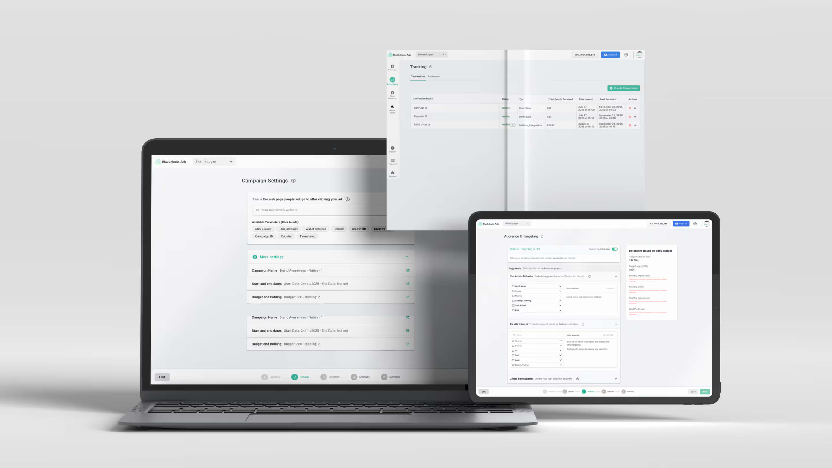
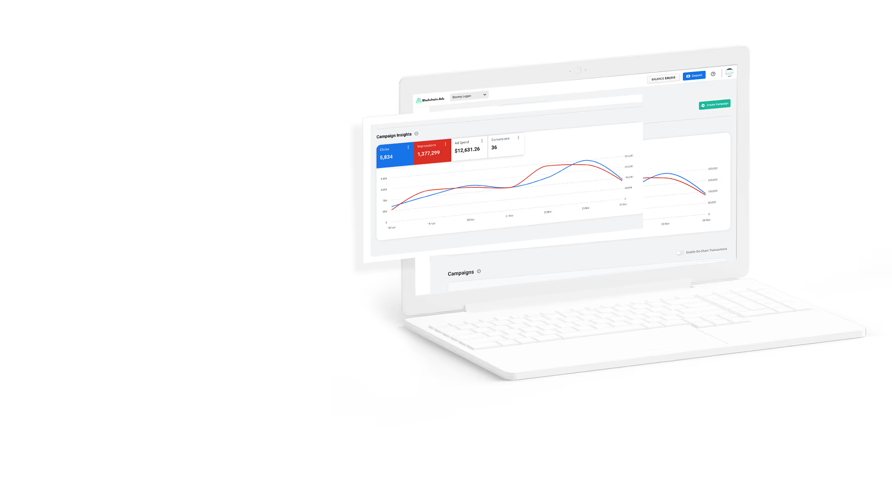
Product images
Screenshots of our products, these are approved for public use.

